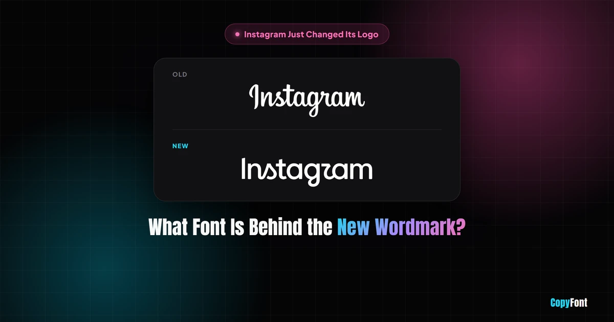
On August 13, 2026, Instagram CEO Adam Mosseri posted the small piece of text that sits next to its camera icon, changed for the first time in roughly a decade, to his own Instagram and Threads accounts. Within a few hours it had a nickname nobody at Meta asked for.
What actually changed
Nothing about the app icon on your phone moved. The gradient camera glyph you tap every day is untouched, this update was strictly to the wordmark, the logotype spelling out "Instagram" that appears in the app's top bar, on the About page, in press materials and across Meta's marketing. The previous wordmark, in use since the 2016 icon refresh, was a loose script styled loosely after cursive brush lettering. The new one keeps a handwritten feel but tightens the letterforms considerably, with a more compact, bolder structure and noticeably rounder "s," "r" and "g" characters, and it still connects some letters, an "n" flowing into "s," an "r" into a swooshed "g," as a nod to the script it replaces. Design lead Jasmine Probst has said the team tested hundreds of directions before landing back close to where they started. The rollout isn't instant either, Instagram is phasing the new wordmark in across the app, website and marketing gradually through the rest of 2026 rather than flipping a single switch, so you may see the old and new versions side by side for a while depending on which surface you're looking at.
A quick history of Instagram's wordmark
This is actually the third distinct Instagram logotype, not the second. When the app launched in 2010, its logo used Billabong, an off-the-shelf script typeface designed by Australian type designer John Costello, chosen because its relaxed, handwritten feel matched the app's early nostalgic, analog-photo branding. By 2013, with the app growing fast, Instagram commissioned designer Mackey Saturday to draw a custom script wordmark rather than continue using a font anyone could buy. The 2016 rebrand, the one most people think of as "the last change," kept that custom script but paired it with the now-familiar gradient camera icon. The August 2026 wordmark is the first ground-up redraw since that 2013 custom lettering, not since 2016, even though 2016 is the more commonly cited date because that's when the app icon itself changed.
Inside the app today, Instagram Sans, Pen and Mono handle the wordmark and brand surfaces, but the everyday interface text you read while scrolling still leans on each platform's native system font, SF Pro on iOS and Roboto on Android, the same as most mobile apps.
The real font: Instagram Sans, Pen and Mono
The wordmark itself is custom lettering, drawn specifically for this logo rather than typed out in an existing typeface, which is why there's no single font name that produces it exactly. But it was built alongside, and visually matches, a proper type family Instagram introduced at the same time. That family has three members, each built for a different job:
None of these three typefaces were designed by an outside foundry that's been publicly credited, Instagram has described the work as coming from its internal design team rather than crediting a named type designer, which is common practice for large in-house brand systems.
What type classification does Instagram Sans fall under?
In typography terms, Instagram Sans is a geometric sans-serif with humanist curve influences, essentially a contemporary remix of grotesque and geometric styles rather than a pure example of either. The "geometric" half shows up in the circular, construction-based letterforms typical of that category (think Futura or Century Gothic), while the "humanist" half softens those shapes with more organic, calligraphy-derived curves so the type doesn't feel cold or mechanical. Meta has said the rounded terminals and punctuation throughout the family are directly modeled on the app's rounded-square "squircle" icon shape, along with a recurring teardrop motif that shows up in dots and curves across the letterforms. The family ships in multiple weights, from light through bold, plus a condensed cut and the separate Pen script style.
Can you download and use it yourself?
Officially, no. Instagram Sans, Pen and Mono are proprietary typefaces licensed for Instagram's own product and marketing, not released as public webfonts or desktop files the way Google Fonts releases its library. You will find third-party sites offering an "Instagram Sans free download," but these are unofficial recreations of unclear legal standing, most explicitly restrict use to personal, non-commercial projects, and none of them are endorsed by Meta. Using one of these files in client work or a paid product is a real legal risk, not a grey area worth gambling on.
If you need something in that visual territory for an actual project, the safer move is a properly licensed lookalike, which is exactly what the next section covers.
| Font | Officially downloadable | Safe for commercial use |
|---|---|---|
| Instagram Sans | No | No |
| Instagram Pen | No | No |
| Instagram Mono | No | No |
| Free OFL lookalikes (below) | Yes | Yes |
Free fonts that look like the new Instagram logo
These are real, legally free fonts under the SIL Open Font License, meaning commercial use is explicitly allowed, unlike an unofficial rip of a proprietary brand font. They're not identical to Instagram's typefaces, no font is, but they sit in the same visual family.
For the rounded geometric sans (Instagram Sans style):
- Manrope, a clean geometric sans with soft, rounded terminals
- Sora, compact and slightly squared off, close to the "squircle" feel Instagram cited
- Plus Jakarta Sans, which is actually the body font used across this site
For the handwritten look (Instagram Pen style):
- Caveat, a casual pen script with natural stroke variation
- Kalam, slightly more upright and readable than Caveat
For the monospace variant (Instagram Mono style):
- Space Mono, a retro-leaning technical monospace
- JetBrains Mono, a cleaner, more neutral coding font
All of these can be added to a real design project as installed fonts. If you just need Instagram-adjacent styled text for a bio, caption or username instead, that's a job for Unicode text rather than an installed font, which is what the font generator and bio builder on this site are built for. For a broader library of properly licensed download-and-install fonts, see our free fonts for creators page.
Instagram's other new fonts: Stories, Reels and celebrity typefaces
The wordmark isn't the only place Instagram has been busy with type. Back in August 2024, the app rolled out seven named fonts for Stories, Reels and captions, replacing the old unlabeled font carousel with styles you can actually identify by name: Poster (bold, serif, built to be the focal point), Journal (a cursive, diary-style script), Signature (a mixed cursive-and-print handwriting look), Editor (a widely-spaced retro serif for formal announcements), Bubble (rounded and playful), Deco (bold and alternative), and Squeeze (a loud, condensed attention-grabber).
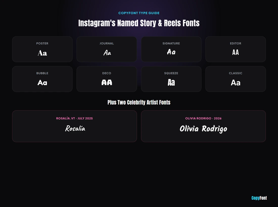
More recently, Instagram started shipping limited-time artist series fonts built from real handwriting. Rosalía.vt launched in July 2025, modeled directly on Spanish pop star Rosalía's own messy, ink-textured handwriting, and a font based on Olivia Rodrigo's handwritten lyrics followed in 2026, tied to her album you seem pretty sad for a girl so in love. Both were available for a limited window inside Stories and Reels rather than as a permanent addition to the font list, so if you saw one and it's gone now, that's expected, not a bug.
Unlike Instagram Sans, none of these Story fonts are downloadable outside the app either. If you want a similar handwritten or bold display look for a bio, caption or thumbnail text you're editing outside Instagram, that's exactly the gap CopyFont's text tools and the free, installable options on free fonts for creators are built to fill.
Why everyone started saying "Instagzam"
The new wordmark draws its "r" narrow and tucked close to the following letter, and at normal reading size on a phone screen a lot of people parsed it as a "u" or a "z" instead. Within hours the redesign had picked up a handful of nicknames it never asked for, "Instagzam" is the one that stuck, though "Instagwam" and even "Instaguam" showed up too, and it spread fast across social platforms as people compared screenshots. The specific complaint centers on letterform ambiguity rather than contrast or size, the two things standard accessibility checks actually measure, so whether the new "r" clears a real legibility bar is more a matter of user testing than a pass/fail ratio. Reception was genuinely split rather than uniformly negative: plenty of people liked the fresher, more geometric energy, others called it harder to read than what it replaced, and a few critics pointed out that a company facing real product complaints, account recovery and AI content moderation among them, chose this moment to focus attention on a wordmark. Comments on Mosseri's own announcement post crossed 2,000 within the first hour, according to TechCrunch's coverage of the reveal.
Is there a Unicode symbol for the Instagram logo?
No, and this hasn't changed with the redesign. There has never been an official Unicode character or standard keyboard emoji for the Instagram camera icon itself, and the Unicode Consortium doesn't add symbols for individual companies' app icons. When people ask how to "get the Instagram logo in text," they're usually reaching for one of three workarounds: the generic camera emoji (📷), which reads as a camera rather than specifically Instagram; a bracket-and-symbol combo like [◉°] that loosely approximates a lens inside a square using existing Unicode characters; or a small downloaded icon file from a resource like Flaticon or Font Awesome, which is a real image asset rather than copy-paste text and needs to be embedded, not typed.
That distinction matters for how CopyFont fits in. This site, the font generator included, converts your typed letters into styled Unicode text, it doesn't create logo icons or brand marks, official or otherwise. If what you actually want is stylized "Instagram" text for a bio or caption, that's exactly what the tools here are for. If you want the literal camera glyph, an emoji or a downloaded icon is the only real option, since no font, ours included, can type out a trademarked logo as a genuine Unicode character.
Frequently Asked Questions
What font is Instagram's new logo in 2026?
The wordmark itself is custom-drawn lettering, not text set in an existing font, so there's no single file that reproduces it. It was designed alongside Instagram Sans, a proprietary geometric sans-serif used for UI text, plus Instagram Pen (handwritten) and Instagram Mono (monospace), all part of the same August 2026 refresh.
Can I download and use Instagram Sans myself?
Not officially. Instagram Sans is a proprietary typeface used only inside Instagram's own app and marketing. Any site offering it as a free download is distributing an unofficial, unlicensed copy, which is not safe to use in commercial work.
Why did people start calling it Instagzam?
The redesigned "r" in the new wordmark is drawn narrow and close to the following letter, and at a glance many people read it as a "u" or a "z," so "Instagram" spelled out looked like "Instagzam." The nickname spread fast on social media within hours of the reveal.
Did Instagram change its app icon too?
No. The camera icon on your home screen is unchanged. Only the text wordmark, the logotype used in headers, marketing and the About page, was redesigned.
What free fonts look like the new Instagram logo?
For the rounded geometric sans-serif body text, Manrope, Sora and Plus Jakarta Sans are close free matches on Google Fonts. For the handwritten Instagram Pen style, Caveat or Kalam get you a similar casual script, and both are free for commercial use under the SIL Open Font License.
When did Instagram last change its logo before this?
The app icon moved to its current gradient camera design in 2016, but the wordmark's last full redraw was actually 2013, when designer Mackey Saturday replaced the original 2010 logo (set in the off-the-shelf Billabong script) with custom lettering. The 2016 rebrand kept that same script and just paired it with the new icon, so August 2026 is the first ground-up wordmark redesign since 2013.
What are Instagram's named Story fonts called?
Poster, Journal, Signature, Editor, Bubble, Deco and Squeeze, added in August 2024. Instagram has also run limited-time artist fonts modeled on real handwriting, including Rosalía.vt in July 2025 and an Olivia Rodrigo lyric font in 2026, both available for a limited window rather than permanently.
Is there an official Unicode symbol or emoji for the Instagram logo?
No. There's no dedicated Unicode character or standard emoji for the Instagram camera icon, and that's unaffected by this wordmark redesign. People typically use the generic camera emoji, a bracket symbol combo like [◉°], or a downloaded icon file from a site like Flaticon or Font Awesome instead.